What is the meaning of the NOTIQ Logo?Updated 5 months ago
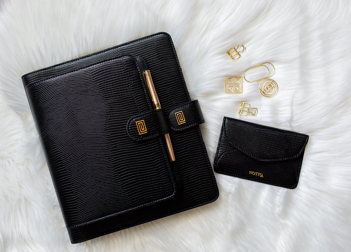
"At first, I chose a stylized Q as NOTIQ's original logo and launched my first collection of products with the Q-logo. I soon realized that though elegant, the original Q-logo won't uniquely identify and serve the brand well into the future. It was time to lean on my art talent and return to my drawing board. I recall scheduling a staycation in my home office/art studio, praying and drawing until an idea emerged. I knew I wanted something simple, iconic, and meaningful. On that hot Summer day in Texas, the "Structure" logo mark was born. It was time for a new chapter.
The new logo mark was introduced to our community by NOTIQ's first anniversary. We call it "Structure" because the logo is a structured collection of lines forming a freeing maze. In our busy world, life can feel like a maze. We hope that the products we create free you and guide you in finding your path so you, too, can make your mark on the world. And oh, did we mention? The "Structure" logo mark is reminiscent of the paper clip, which signifies organization and order."
- VJ, Founder & Designer